Text Animation Effects in Smooth Capture: A 2026 Guide
You're probably in one of two situations right now. Either you've got a product demo that feels flat because the labels just sit there, or you've tried to add motion and ended up with text that looks busy, slow, or oddly homemade.
That gap between “plain screen recording” and “full motion design project” is where text animation effects matter most. Good text motion directs the eye, clarifies the message, and makes a video feel finished without turning the edit into a multi-hour keyframe exercise. The trick isn't using more effects. It's using the right ones, with timing that supports the message instead of competing with it.
Table of Contents
- Why Text Animation Is Your Secret Weapon
- The Principles of High-Impact Text Animation
- Creating Essential Text Entrances and Exits
- Mastering Advanced Text Animation in Smooth Capture
- Practical Use Cases for Business Workflows
- Troubleshooting and Exporting for a Flawless Finish
Why Text Animation Is Your Secret Weapon
A polished product demo usually does one thing extremely well. It tells you where to look before you have to ask. The cursor moves, the interface changes, and the text appears at exactly the right moment to label the feature, reinforce the benefit, or frame the next step.
That's why text animation effects aren't decoration. They're a communication tool. In product videos, onboarding clips, and feature teasers, animated text helps sequence information, establish hierarchy, and create transitions the viewer can follow without effort.
Animation has a long lineage, and modern digital motion workflows grew out of the broader shift from traditional methods to digital production. That shift made layer separation, timing, and compositing practical at scale across film, web, and marketing, which is why animated titles and motion-graphics overlays are now standard parts of video production rather than specialty work in this overview of animation's evolution.
The five text treatments that do most of the heavy lifting are straightforward:
- Entrances that introduce a title or callout cleanly
- Exits that remove clutter once a point has landed
- Emphasis moves that punch up one word or phrase
- Typing effects that make instruction feel live and conversational
- 3D perspective treatments that place text into the visual world of the screen
If you make launch videos or paid creatives, the same thinking shows up in mobile app ad optimization. Motion has to clarify the offer fast, especially when the viewer is scanning, not studying.
For social clips, the same rule applies. Text needs to enter with purpose, not just style, especially in short-form formats like the examples discussed in social media video workflows.
Practical rule: If the animation doesn't improve clarity, pacing, or emphasis, it's visual overhead.
The Principles of High-Impact Text Animation
Bad text motion usually fails for one of four reasons. It starts too abruptly, it ends too stiffly, it takes too long to reveal, or it ignores how people read.
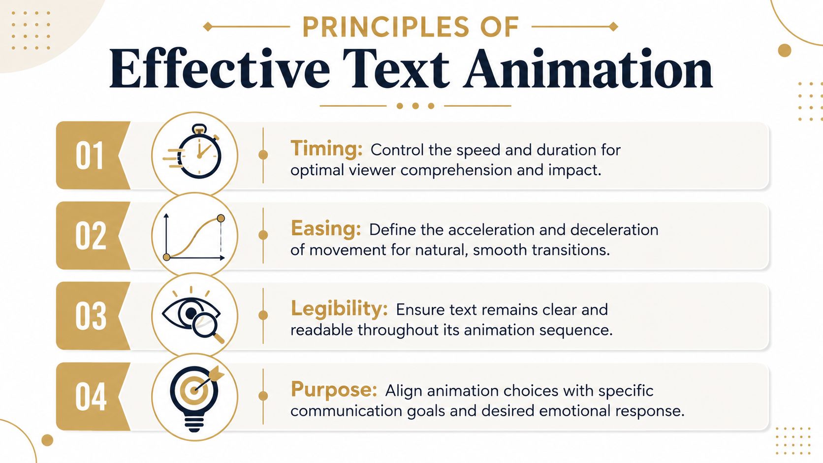
Timing controls comprehension
Timing is the first thing viewers feel, even if they can't name it. A title that appears too slowly drags the edit. A label that pops in too fast feels accidental. The right duration gives the eye enough time to catch the text, register it, and move back to the product or action.
This matters even more with sequential reveals. Expert guidance on text animation warns against waiting for each character to fully finish before starting the next. Instead, characters should overlap, and the easing should start slow, accelerate in the middle, and ease out at the end, as explained in this guide on common text animation mistakes.
A simple way to think about timing:
| Situation | Better choice | Why it works |
|---|---|---|
| Feature label on a product demo | Short entrance, short hold | Keeps attention on the UI |
| Explainer headline | Slightly longer entrance | Gives the message weight |
| Dense phrase or sentence | Minimal reveal effect | Preserves readability |
| Social cut-down | Fast entry with clear hierarchy | Matches short attention windows |
Easing is where polish lives
Linear motion is the fastest way to make good design look cheap. Real movement has acceleration and deceleration. Text should do the same.
Use these mental models when choosing easing:
- Ease-out: Great for entrances. The text arrives quickly, then settles.
- Ease-in: Useful for exits. The text starts moving gently, then clears the frame.
- Ease-in-out: Best for moves that need to feel smooth and neutral.
If you've ever seen a lower-third or feature label feel “floaty” in a bad way, it usually isn't because the designer chose the wrong effect. The easing was wrong for the job.
Smooth motion doesn't mean slow motion. It means the text behaves like it belongs in the scene.
Legibility beats flair
The text still has a job to do. It has to be read. That means animation should support reading order, not fight it. In English, that means left to right sequencing for most reveals and staggered builds.
A few guardrails keep things readable:
- Animate in reading order: Don't reverse a reveal unless you have a specific visual reason.
- Avoid overlong type-ons: If viewers are waiting for the sentence to finish assembling, you've lost momentum.
- Keep contrast stable: If the background is active, give the text enough separation with placement, size, or a backing treatment.
- Reserve dense animation for short text: One or two words can carry more movement than a full sentence.
Purpose decides the effect
The strongest text animation effects are chosen for function. Ask one question before you animate anything: what is this text supposed to do?
If the text is informational, use a clean entrance. If it's emotional or promotional, add more punch. If it mirrors narration, type-on or kinetic timing can reinforce cadence. If it needs to feel embedded in the product world, perspective is the better move.
That's the difference between effects that look added on and effects that feel designed in.
Creating Essential Text Entrances and Exits
Most videos only need a small set of entrance and exit moves. If you can build a clean fade, a directional slide, and a scale-based pop with good timing, you can handle most titles, UI labels, chapter cards, and callouts.
A typical timeline for this kind of work looks like this:
When I'm moving quickly, I don't start by asking which effect looks coolest. I start by asking what kind of entrance the clip needs. Does the text need to gently appear, point the eye in a direction, or land with a bit of energy?
The subtle fade
The fade is the workhorse. It's easy to underestimate because it's simple, but that's also why it survives repeated use across product demos, explainers, and internal training content.
Use a fade when the text is supporting the screen, not competing with it. Feature names, tooltip-style labels, and short context captions all benefit from a restrained opacity build.
A reliable workflow looks like this:
- Set the text's starting opacity at zero.
- Move a short distance forward on the timeline.
- Set the end opacity at full visibility.
- Apply easing so the fade doesn't feel mechanical.
- Hold the text long enough to be read without lingering.
What usually goes wrong is the hold, not the fade itself. Teams often bring text in well, then leave it on screen after the point has already landed. That creates clutter and weakens the next beat.
For clips headed to app marketplaces, clean title pacing matters even more because every second has to earn its place. That's worth keeping in mind if you're also working through an App Store preview video guide.
The directional slide
Slides do more than add motion. They establish spatial logic. When text moves in from the left, right, top, or bottom, it tells the viewer where the attention should travel next.
Use a slide when the text introduces a nearby interface element, especially in walkthroughs. If a button sits on the right side of the screen, a text label sliding from a nearby direction often feels more connected than a generic fade.
A few practical choices make slides feel intentional:
- Keep the travel distance moderate: Too far and it feels theatrical.
- Match direction to layout: Move text in a way that supports the screen composition.
- Let it decelerate into place: The final settle is what makes it feel professional.
- Combine with a mild fade: A little opacity change softens the move.
Here's a good visual reference for pacing and sequencing in action:
The crisp scale-up
Scale-based entrances are useful when you need emphasis. They work well for headlines, promotional phrases, stat callouts without numeric overload, and short benefit-driven text.
The trap is making them bouncy when the brand needs precision. A clean scale-up should feel like the text is locking into place, not springing around for attention.
Try this approach:
| Goal | Better scale behavior | Common mistake |
|---|---|---|
| Premium product feel | Small scale change with ease-out | Overshooting too much |
| Energetic social clip | Slightly faster pop-in | Pairing it with too many other effects |
| UI callout | Scale plus fade | Starting too large off-screen |
When to animate out
Exit animations don't get enough attention, but they matter because they control visual cleanup. If entrances tell the viewer what matters now, exits tell them that moment has passed.
Use exits when the next beat needs a clean frame. Fading out is usually safest. A short directional move can work if the edit already has a strong spatial flow. Scale-down exits are fine for stylized edits, but they can feel gimmicky if overused.
Working habit: Build one entrance family and one exit family for a project. Reuse them across scenes so the whole video feels like one system.
That consistency saves more time than chasing a new effect for every line of text.
Mastering Advanced Text Animation in Smooth Capture
Once the basics are solid, advanced text animation effects become less about novelty and more about matching the effect to the communication problem. Some moments need a human, narrated feel. Others need rhythmic emphasis. Some need to make flat text feel physically attached to a screen or device.
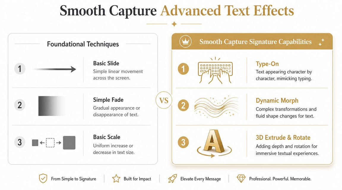
Type-on for guided narration
Type-on works best when the viewer should feel like they're following a thought in real time. It's a natural fit for tutorial steps, search queries, prompts, commands, or short instructional phrases.
The reason it works is psychological as much as visual. It slows the delivery slightly, which can make the action feel more deliberate and easier to follow. But it only works when the text is short enough that the reveal doesn't become a delay.
Use type-on for:
- Search and command moments: Text that mimics input feels intuitive here.
- Tutorial labels: A short phrase can land like guided instruction.
- Conversational explainers: It creates a lighter, more personal rhythm.
Avoid it for paragraphs, disclaimers, or long feature descriptions. At that point, the viewer is waiting for the animation instead of reading the message.
Kinetic text for emphasis
Kinetic typography is what you reach for when one word needs more weight than the rest of the sentence. This isn't about turning every line into a music video. It's about selectively adding rhythm and emphasis where the script needs a visual accent.
The most effective version is usually restrained. Animate the keyword, not every word. Shift position, opacity, or scale around the voiceover cadence. Let the supporting words stay calmer.
This style works especially well for:
- launch videos with benefit-led copy
- teaser edits built around short phrases
- social versions cut from a longer feature demo
- founder videos where the delivery needs a little more structure
Animate the point of emphasis, not the entire sentence. Viewers should remember the message, not the trick.
3D perspective for product context
The gap between high-end motion design software and practical business video tools becomes obvious. In After Effects, the most technically capable workflow for detailed text animation uses Text Animators and Selectors for per-character control over properties like position and opacity, as described in Adobe's guide to animating text in After Effects. That approach is powerful, but it also asks you to manage a deeper stack of properties and logic.
High-level controls for perspective-based text change the equation. Instead of building the effect from multiple low-level parameters, you shape the result directly. That makes perspective text usable in day-to-day production, not just showcase edits.
Use perspective text when:
| Creative problem | Better effect | Reason |
|---|---|---|
| You need text to feel attached to a device screen | 3D perspective | Adds spatial credibility |
| You want depth without a full VFX workflow | Perspective tilt and placement | Faster to adjust |
| You're localizing multiple versions | Controlled perspective preset | Easier to maintain |
A key advantage isn't just the look. It's editability. When a team has to revise feature names, swap UI shots, or localize messaging, effects built with simpler, high-level controls tend to survive those changes better.
That's the hidden dividing line between “impressive” and “usable.”
Practical Use Cases for Business Workflows
The best text animation effects aren't the ones that get the most compliments from other editors. They're the ones that keep working when marketing needs three cut-downs, support needs a tutorial variant, and the product team changes the feature name the day before export.
Text animation is especially useful when the story depends on sequence. Educational material on timelines defines them as visual representations of events in chronological order and shows how structure, pacing, and repeated elements guide attention over time. Modern tutorials also demonstrate duplicating elements and adjusting timing across multiple pages, which is a good model for repeatable production systems in this overview of timeline construction.
Product marketing and launch assets
A product marketer announcing a new feature usually needs three kinds of text. A headline that sets the promise, labels that identify what's changing on screen, and short emphasis beats that reinforce value.
That's where a simple system works well:
- fade or slide for feature labels
- scale-up for the main value proposition
- selective kinetic timing for one or two benefit words
- perspective text only when it strengthens the product context
If every line moves differently, the launch video starts to feel assembled instead of designed. Repetition is a strength here.
Onboarding and customer education
Training teams need clarity more than flourish. Type-on can help when introducing a step, search phrase, or action cue, but most onboarding content benefits from stable labels and predictable transitions.
The practical win is templating. Build one lower-third style, one step-title animation, and one callout treatment. Duplicate them across lessons and only adjust wording and timing. That mirrors how timeline-based storytelling has evolved into a more repeatable workflow rather than a one-off manual process.
A simple reuse checklist helps:
- Lock the style first: Font, placement, and animation family should stay consistent.
- Change only what matters: Usually the text content and scene timing.
- Review for reading speed: A reusable preset still needs scene-specific timing.
- Keep exits clean: Tutorials get messy fast when old labels linger.
Agency delivery and repeatable systems
Agencies often face a different pressure. The motion has to look premium, but it also has to survive rounds of feedback. That's why maintainability matters as much as style.
A reusable text system gives you three advantages:
- faster turnaround on revisions
- cleaner brand consistency across deliverables
- easier adaptation for vertical, horizontal, and cut-down formats
Clients don't usually ask whether an effect used advanced selectors or custom expression logic. They care whether the text feels polished, matches the brand, and can be updated without breaking the edit.
That's the operational side of motion design that gets ignored too often.
Troubleshooting and Exporting for a Flawless Finish
Most text problems show up at the end. The edit felt good while you were building it, then the final playback reveals that a label is too slow, a headline is hard to read, or the animation feels fussier than the scene around it.
The fastest fixes are usually small.
Finishing touches that matter
- If the text feels slow: Shorten the entrance before you remove the effect entirely.
- If it feels abrupt: Adjust easing first. The motion may be fine, but the acceleration curve is wrong.
- If readability drops: Reduce movement, increase hold time, or simplify the reveal.
- If the frame looks crowded: Animate the text out sooner.
- If localization is likely: Choose the version that's easiest to edit later, even if it's less flashy.
That last point matters for teams building video libraries. Practical guidance on production tradeoffs argues that the best animation is often the one that's fastest to localize and easiest to edit, not the most visually complex, as discussed in this article on text animation tradeoffs in production workflows.
For accessibility and clarity, subtitle treatment also affects the final result, especially in social and training contexts. If text layers and spoken dialogue are competing, it helps to review your approach to adding subtitles to videos.
Simple export guide
| Destination | Prioritize | Text check before export |
|---|---|---|
| YouTube demo | Clarity and clean motion | Make sure labels read at normal playback |
| Social clip | Fast pacing and legibility | Check mobile-sized text and short holds |
| Knowledge base tutorial | Stability and readability | Remove unnecessary emphasis effects |
| App preview | Tight sequencing | Make sure each title appears only as long as needed |
One final pass catches most issues. Watch once with sound, once muted, and once focusing only on the text. If the message still lands all three times, the animation is doing its job.
Smooth Capture sits in a practical sweet spot for teams that need polished text animation effects without turning every screen recording into a full motion graphics project. If you want a faster way to create product demos, onboarding videos, App Store previews, and launch assets with perspective treatments, device frames, cursor effects, subtitles, and a timeline built for repeatable editing, try Smooth Capture.
Ready to create stunning app demos?
SmoothCapture makes it easy to record your screen with 3D device frames, cinematic cursor effects, and professional editing tools.