Product Launch Videos: The Complete Guide for 2026
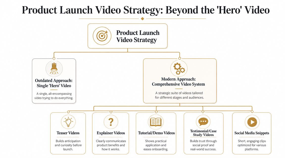
Launch week usually looks the same. Product wants the new feature shown accurately. Sales wants a version they can send to prospects. Growth wants short paid-social cuts. Support wants something they can reuse for onboarding. Then someone says, “Let's just make one launch video.” That's the mistake. The teams that get real mileage from product launch videos don't treat them as a single polished asset. They build a video system. One core narrative. Multiple outputs. Different runtimes, aspect ratios, and calls to action for different moments in the funnel. That approach saves review cycles, reduces last-minute edits, and gives every team something usable instead of forcing one video to do five jobs badly.
Planning Your Launch Video Strategy
Most launch teams still start with the wrong question. They ask, “What should our launch video say?” The better question is, “What set of assets do we need, and what job does each one do?”
A single hero video sounds efficient, but it usually collapses under competing goals. The awareness version needs energy and pace. The consideration version needs proof. The conversion version needs a direct next step. Put all of that into one edit and you often end up with a video that feels busy, vague, and too long for distribution.
Build around objectives, not formats
Start with the business outcome.
| Objective | Video format that usually fits | What it needs to do |
| Awareness | Teaser or announcement cut | Create curiosity fast |
| Consideration | Explainer or feature walkthrough | Show why the product matters |
| Conversion | Demo or landing page video | Remove doubt and drive action |
In this context, product launch videos become more operational than artistic. You're not choosing between “fun” and “serious.” You're matching a format to a job. A practical launch system often includes:
- Hero asset: A concise overview that anchors the message.
- Short cutdowns: Versions for social posts, paid distribution, and retargeting.
- Demo edit: A clearer workflow-focused video for the landing page or sales follow-up.
- Micro-assets: GIFs, silent loops, screenshots, and captioned snippets for email, social, and in-app announcements.
Design for the screen people actually use
If the video is meant to persuade, mobile-first planning matters. Atlassian notes that 82% of customers are convinced to purchase after watching a video and 69% of people in the U.S. watch videos on smartphones in its guidance on product launch video strategy. The same guidance recommends vertical 9:16 framing, captions, and short CTAs like “Buy now” or “Learn more.” That combination changes production choices early. It affects framing, text size, edit rhythm, and where you place on-screen UI. A desktop-first video often looks cramped and unreadable when repurposed late for mobile.
Practical rule: If your team plans mobile versions after the final edit, you're already paying an avoidable rework tax.
Good strategy work also depends on discipline outside video. If your launch messaging is fuzzy, your asset system will be fuzzy too. Teams that need alignment before production usually benefit from these expert tips for content strategy, especially when they're trying to connect campaign messaging, channel plans, and creative execution.
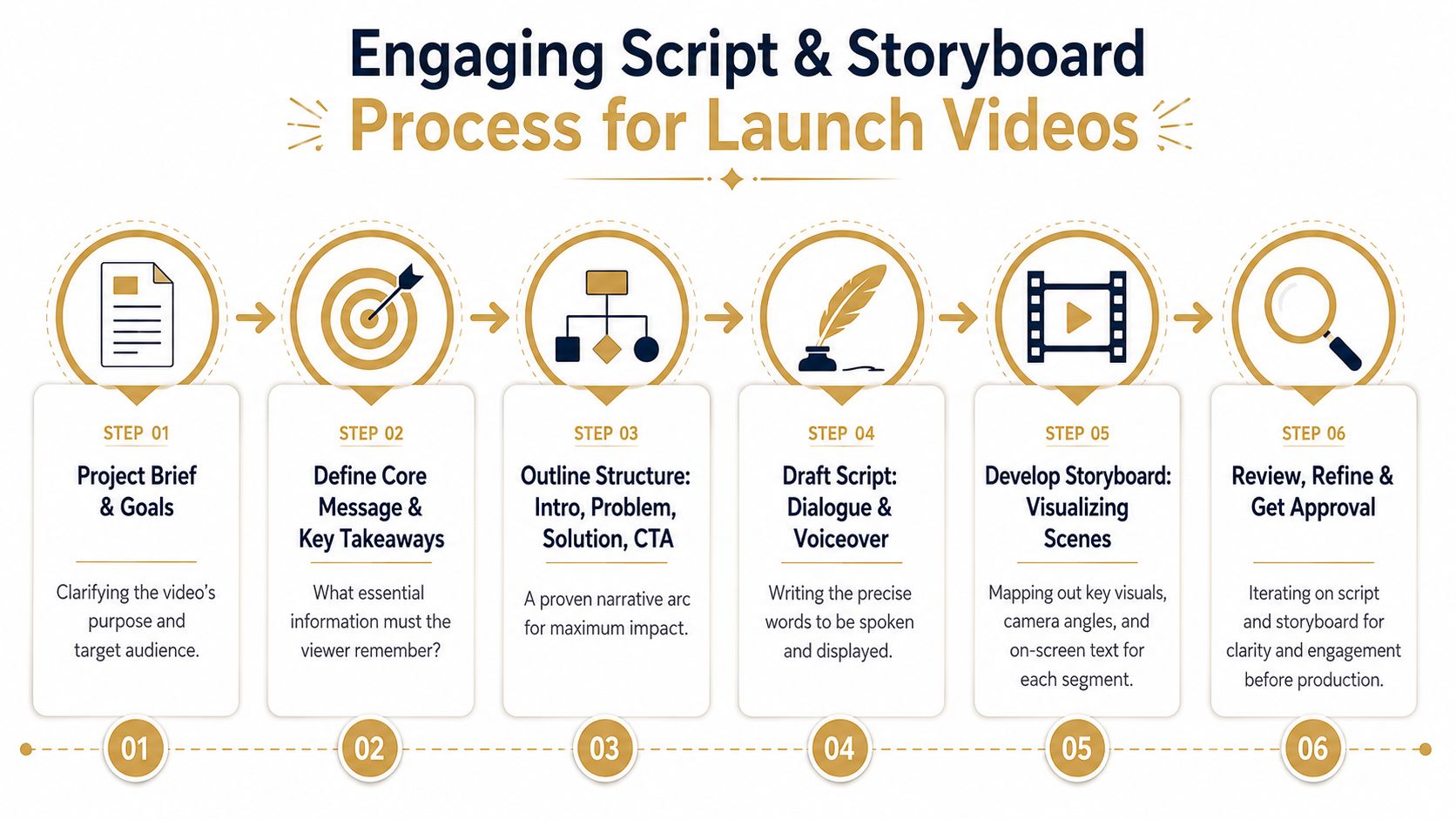
Creating a Winning Creative Brief
Bad launch videos usually don't fail in editing. They fail in planning. The script wanders because the team never agreed on audience, priority, or CTA. Then every stakeholder tries to fix the problem in review. A strong creative brief prevents that.
Treat the brief as the project contract
The brief should settle the decisions that create downstream friction. Keep it short enough that people will read it, but specific enough that it can end arguments. Include these fields every time:
- Primary objective: Pick one. If the goal is demo requests, don't let the video drift into a broad brand film.
- Audience: Name the buyer, user, or segment. “Everyone” produces vague messaging.
- Core message: State the one thing the viewer should remember.
- Single CTA: Choose the next step. “Learn more,” “Start trial,” and “Book demo” are not interchangeable.
- Tone and style: Decide whether the piece should feel fast, polished, technical, founder-led, or utility-first.
- Distribution plan: List where the assets will live so the team knows aspect ratios, pacing, and caption needs before production.
A simple brief structure that works
I've found that the easiest way to keep a launch on track is to write the brief in plain language. No agency jargon. No brand theater. Try this structure:
- What are we launching?
- Who is this for?
- What problem does it solve right now?
- What proof will we show on screen?
- What should the viewer do next?
- Where will each version be distributed? That last line matters more than teams expect. A landing-page demo, a LinkedIn cut, and an email embed need different edits. If you already know you'll need product-first examples, this guide to a product demonstration video is useful for pressure-testing whether your launch narrative shows the workflow clearly enough.
The brief should answer hard questions before anyone records a screen or writes voiceover.
What a weak brief sounds like
A weak brief uses broad language like “introduce the product,” “build excitement,” or “show innovation.” None of that tells an editor what to cut, what to keep, or what to prioritize. A better brief says, in effect: “This video is for operators evaluating the new feature. Show the workflow, prove setup is simple, and drive them to the launch page.” That level of specificity makes scripting faster and approvals calmer.
Scripting and Storyboarding for Engagement
Once the brief is solid, scripting gets easier. You're not trying to say everything. You're deciding what earns attention and what deserves screen time.
The most reliable structure for product launch videos is simple: hook, demo, CTA.
Open with the value, not the setup
Don't spend the first lines on company context, category framing, or “today we're excited to announce.” Viewers don't care yet. Industry guidance in Arcade's roundup of product launch video examples recommends establishing a clear value proposition within the first 10 seconds, aiming for 30–45 seconds for teasers or up to three minutes for in-depth demos, and showing something new roughly every 20 seconds to maintain engagement. That pacing guidance forces better writing. It pushes teams to strip out throat-clearing and put the payoff first. A practical script often follows this rhythm:
- Hook: State the problem or payoff immediately.
- Demo: Show the product solving that problem in a visible, concrete way.
- CTA: End with one clear next action.
Write for what the viewer sees
Screen-demo scripts fail when they read like blog posts. If the product is on screen, the narration should support the action, not duplicate it. Here's the difference:
| Weak script move | Better script move |
| Explains every feature in sequence | Focuses on one workflow or outcome |
| Uses abstract benefit language | Ties benefits to visible actions |
| Adds multiple CTAs | Ends with one next step |
| Narrates obvious clicks | Uses narration to frame why the action matters |
Don't describe the interface line by line. Guide attention to the decision, the result, or the contrast with the old workflow.
Storyboards matter for screen recordings too
A lot of teams storyboard live action and improvise product capture. That's backwards. Screen recordings need planning just as much. Your storyboard should map:
- What screen appears when
- Where zooms happen
- Which cursor movements need emphasis
- What text overlays reinforce the message
- When to cut from broad context to detail That work saves a lot of editing pain. If a step needs a slow zoom, a callout, and a pause for readability, you want to know that before recording ten takes. A useful reference for pacing and visual sequencing sits below. Watch how every beat moves the viewer forward instead of lingering on setup.
Keep the board practical
You don't need a polished agency deck. A lightweight storyboard in a doc, slide, or spreadsheet is enough if it captures the key decisions. Use one row per scene with these columns:
- Narration
- On-screen action
- Visual emphasis
- Overlay text
- Editor notes That's enough to align product marketing, product, design, and whoever's handling the edit.
The Production and Editing Workflow
Production gets easier when the upstream decisions are already made. At this point, the job is execution. Capture the product cleanly, make the viewer's eye go where it should, and cut everything that slows momentum.
Record for clarity first
A polished launch edit starts with disciplined capture. Close irrelevant tabs. Remove noisy browser extensions. Clean the desktop. Decide whether you're recording a real account, a sandbox, or a staged environment. If the product data looks messy or confidential, the video looks risky and rushed. For screen-based product launch videos, I usually recommend recording more takes than you think you need, but fewer workflows than you're tempted to include. One clean sequence beats five half-explained ones. A strong capture setup usually includes:
- Controlled UI state: Notifications off, sample data prepared, windows sized correctly.
- Consistent input: Cursor movement should be deliberate, not frantic.
- Separate audio decision: Record voice live only if the presenter can stay tight. Otherwise add voiceover later.
- Shot variants: Capture a full-flow take, then record close-up retakes for critical interactions.
Edit around attention, not chronology
Most first drafts follow the order the product works. That's logical for internal training, but it's rarely the best structure for launch marketing. Launch edits should follow interest. Start with the payoff. Jump to the differentiating moment. Then bridge the viewer through the minimum required context. If setup takes too long, cut it. If a click doesn't change understanding, remove it. Tooling offers support. Some teams use Descript for transcript-based cleanup. Others use Screen Studio for polished screen capture effects. Smooth Capture is another option for macOS teams. It handles screen recording and editing in one app, with device frames for iPhone, iPad, and Mac, automatic zoom, cursor effects, webcam overlays, background replacement, subtitles, and a timeline editor for trimming and rearranging scenes. If your team is refining process, not just aesthetics, this guide on collaborative video editing is useful because the main bottleneck in launch work is often review flow, not software capability.
Use motion to direct attention
Good screen-video editing is mostly attention design. Zooms, cursor emphasis, highlights, and framing should answer one question: “Where should the viewer look right now?” Use those effects with restraint.
| Editing choice | When it helps | When it hurts |
| Automatic zoom | Draws focus to a critical interaction | Feels jumpy if used on every click |
| Cursor effects | Makes intent obvious in dense UI | Looks gimmicky when exaggerated |
| Device frames | Adds context for mobile or app previews | Wastes space if the UI is already small |
| Webcam overlay | Adds human presence in founder or walkthrough videos | Distracts from product detail if too large |
Editing note: If an effect calls attention to itself more than to the product, cut it.
Build one master timeline, then branch
This is the workflow shift that saves time. Don't edit a hero video, export it, and then “adapt” it by hand for every channel. Build a modular timeline with reusable sections. That master project should contain:
- Core opening
- Primary product proof
- Optional persona-specific scenes
- Multiple CTA endings
- Caption-safe text placements
- Alternate aspect ratio layouts Once that structure exists, making cutdowns becomes a selection exercise instead of a rebuild. Teams looking for practical examples beyond software setup can also learn from this piece on creating product videos for conversions, especially around shaping the edit so the product, CTA, and offer stay tightly connected.
Polish last
Leave music, transitions, and visual flourishes until the structure is right. Teams often spend too much time making weak footage prettier instead of making the narrative cleaner. If the opening doesn't land, no soundtrack fixes it. If the workflow isn't obvious, no animation package saves it. Sequence first. Emphasis second. Cosmetics third.
Distributing and Repurposing Your Video System
Finishing the main edit is only half the job. Launch teams get the most value when they treat the core asset as raw material for distribution.
That means repurposing by channel, audience, and intent.
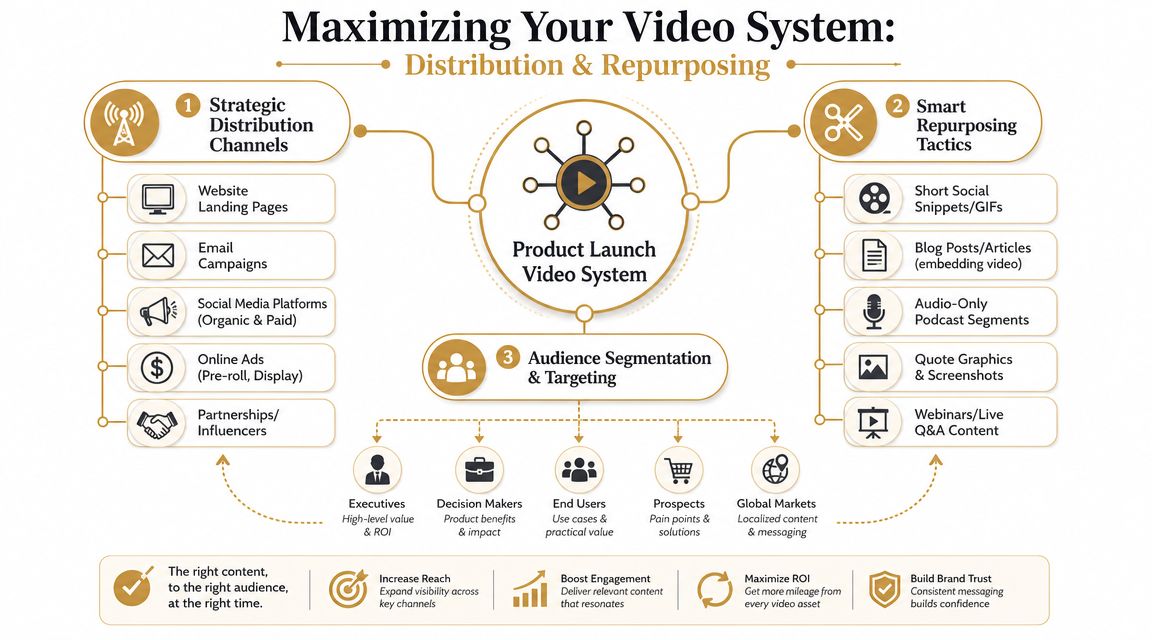
Match the asset to the moment
A social viewer scrolling a feed behaves differently from a buyer evaluating the product on your landing page. The edit should reflect that. Vidico's guidance on launch video distribution recommends 30–45 seconds for teaser-style launch videos in social feeds, while fuller demos for a landing page or YouTube can extend to three minutes. That's not just a runtime decision. It changes structure.
- Social cutdown: Open with tension or novelty, rely on captions, and ask for a lightweight next step.
- Landing page demo: Spend more time proving workflow and reducing hesitation.
- Email GIF or snippet: Deliver one memorable product moment that earns the click.
Turn one edit into a campaign package
A launch system works because the outputs are planned together. The hero video gives you the narrative spine. Everything else is a derivative built for a different context. A practical repurposing package might include:
- Vertical cutdowns: For Stories, Reels, Shorts, and mobile-first paid placements.
- Square social versions: Useful when feed real estate matters more than cinematic framing.
- Captioned silent clips: Better for autoplay environments.
- GIFs and stills: Handy for lifecycle emails, changelog posts, and internal launch comms.
- Sales snippets: Small proof clips that reps can drop into follow-up emails. If your team is publishing across several channels at once, operational consistency matters as much as the asset itself. This guide to cross-platform social media publishing is useful when launch day requires coordinated scheduling instead of manual posting chaos.
Don't repurpose blindly
Repurposing isn't cropping. It's rewriting with constraints. A vertical clip may need larger text, earlier branding, and a different opening shot. A silent autoplay version needs stronger captions and clearer visual transitions. If accessibility and mobile readability are part of the plan, this walkthrough on adding subtitles to videos covers the practical side well.
Your launch system should feel like one campaign expressed in different formats, not one video awkwardly resized five times.
Measuring Performance and Proving ROI
A launch video doesn't succeed because people watched it. It succeeds because it moved the metric it was built to move. That sounds obvious, but teams still over-index on views because views are easy to screenshot in a postmortem. They don't tell you much on their own.
Start with the brief, not the dashboard
The fastest way to create meaningless reporting is to pull every metric each platform offers. Instead, go back to the original objective and pick the handful of signals that match it. If the asset was built for awareness, look at whether people stayed long enough to absorb the message and whether the clip earned clicks into the next touchpoint. If it was built for conversion, tie the video to page actions, demo requests, trial starts, or influenced pipeline in your existing reporting stack. A simple framework works well:
| Goal type | Useful signals |
| Awareness | View-through quality, engagement, click-through behavior |
| Consideration | Landing-page interaction, replay behavior, demo page progression |
| Conversion | CTA clicks, trial starts, demo requests, influenced opportunities |
Compare assets inside the system
This is another reason the video-system approach wins. It lets you evaluate formats against jobs instead of expecting one hero asset to carry every stage. A short teaser might do its job if it drives qualified traffic even when average watch time is modest. A longer demo might justify lower reach if the people who watch it convert at a stronger rate downstream. Those are different success conditions.
What to ask after launch: Which asset changed buyer behavior, and at what point in the funnel?
Use the next launch to get smarter
The best post-launch review usually isn't a creative critique. It's an operational one. Look for patterns like:
- Drop-off before the product appears: Your opening is too slow.
- High engagement, low click-through: The CTA is weak or mistimed.
- Strong landing-page performance, weak social: Your cutdowns aren't built for feed behavior.
- Too many revision rounds: The brief or review process broke before production started. That kind of analysis helps the next launch more than any vague conclusion about whether the video “felt strong.”
Your Complete Product Launch Video Checklist
A repeatable launch process beats heroic last-minute effort. The more often your team ships product launch videos, the more important the operating system becomes.
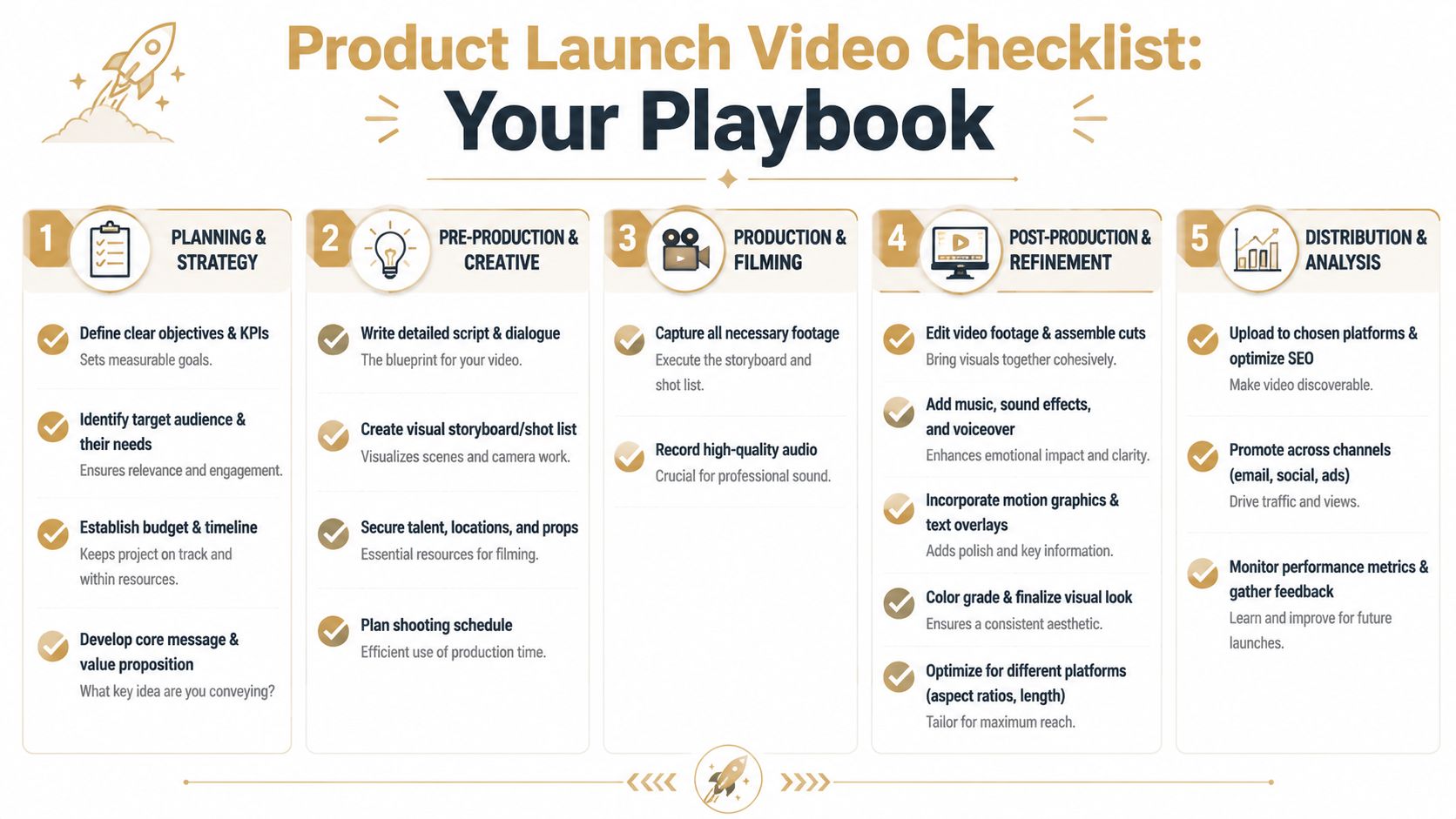
Use this before every launch
Most guides stop at creative advice. The more useful shift is operational. N2 Productions argues that teams need a repeatable system and should plan a package of assets such as a 60-second hero video, 15-second cutdowns, and 6-second bumpers from the start in its piece on multi-channel launch video planning. Use this checklist to keep that system intact:
- Strategy
- Define one primary objective: Awareness, consideration, or conversion.
- Choose the asset set: Hero, cutdowns, demos, GIFs, and internal enablement clips as needed.
- Lock distribution early: Decide destinations before scripting.
- Pre-production
- Write the brief: Audience, message, proof, CTA, tone, channels.
- Approve the script: Tight opening, visible proof, one CTA.
- Storyboard the product flow: Plan zooms, overlays, and scene order.
- Production
- Prepare the product environment: Clean data, consistent UI, no distractions.
- Record multiple takes: Capture alternates for key product moments.
- Separate optional scenes: Keep persona-specific material modular.
- Post-production
- Edit the master version first: Prioritize clarity and pacing.
- Create channel variants: Resize, recut, and rewrite where needed.
- Add captions and QA everything: Check readability, timing, and CTA behavior.
- Post-launch
- Track by objective: Don't default to vanity metrics.
- Review winners and weak spots: Opening, proof, CTA, channel fit.
- Archive reusable blocks: Keep scenes and templates ready for the next launch. If your team ships launch demos, onboarding videos, or product walkthroughs regularly, Smooth Capture is worth a look. It's a native macOS app for recording and editing screen-based videos with device frames, cursor effects, automatic zoom, subtitle support, webcam overlays, and a timeline built for repeatable production workflows.
Ready to create stunning app demos?
SmoothCapture makes it easy to record your screen with 3D device frames, cinematic cursor effects, and professional editing tools.