How to Create Tutorial Videos: A Pro-Level Guide for 2026
You’ve probably watched the kind of tutorial that makes a simple task feel harder. The cursor darts around. A Slack notification pops up mid-sentence. The speaker backtracks, apologizes, clicks the wrong menu, then leaves the mistake in. By the end, you know the product a little better, but you trust the company a little less.
Business-critical tutorials work differently. A good onboarding clip, feature demo, or internal training video feels calm. The framing is intentional. The narration lands exactly when the action happens. The viewer never wonders where to look. That polish isn’t just aesthetic. It shortens support loops, reduces repeat explanations, and makes your product or process feel well run.
Teams used to assume that quality like that required a video crew, a motion designer, and too much time. It doesn’t. The workflow matters more than the budget. If you need another perspective on training-first production, Zanfia’s video creation guide is a useful companion read because it treats tutorial work as operational communication, not just content marketing.
Table of Contents
- From Clunky to Cinematic Your Tutorial Video Playbook
- Planning and Scripting for Clarity
- Setting Up Your Recording Environment
- Recording Your Screen Like a Pro
- Editing for Engagement and Polish
- Exporting and Distributing Your Tutorial
From Clunky to Cinematic Your Tutorial Video Playbook
The difference between an amateur tutorial and a polished one usually isn’t talent. It’s decision-making.
A clunky tutorial tries to capture everything in one take. The creator opens the app, improvises the explanation, and hopes the edit will save it later. That approach usually produces bloated footage, inconsistent pacing, and a final video that feels like watching someone think out loud. For a casual social post, maybe that’s acceptable. For product education, customer onboarding, or internal process training, it isn’t.
A polished tutorial feels cinematic in the ways that matter for learning. The opening tells the viewer what they’ll accomplish. The screen stays clean. The speaker sounds prepared without sounding scripted. The edit removes hesitation. Important actions get visual emphasis. If the video uses a face cam, device shot, or product close-up, each cut earns its place by making the next step easier to understand.
A tutorial doesn’t need to look flashy. It needs to make the next action obvious.
That’s the standard worth chasing. Not “high production value” as decoration. High clarity under real deadlines.
The playbook that follows is built for teams who publish often and can’t afford to reinvent their process every time. Product marketers need launch explainers that feel on-brand. Customer education teams need repeatable onboarding modules. Founders need demos that don’t look thrown together. Support teams need short walkthroughs that answer one question cleanly and then get out of the way.
If you’re trying to figure out how to create tutorial videos that look professional without turning every recording into a mini film production, the answer is usually simpler than expected. Plan tightly. Capture cleanly. Edit for guidance, not spectacle. Export with reuse in mind.
Planning and Scripting for Clarity
Most tutorial problems start before recording. The creator hasn’t decided what the viewer should do after watching, so the video wanders. Then they compensate by adding more explanation, more examples, and more runtime. That almost always makes the result worse.
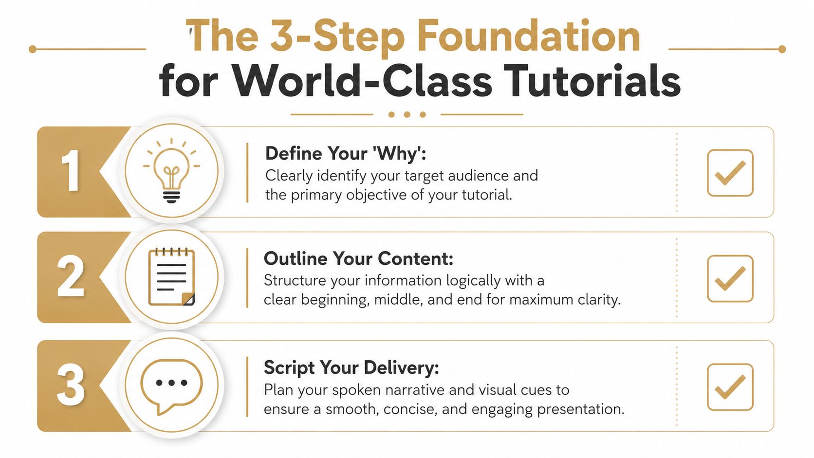
Start with one outcome
A useful tutorial teaches one clear job. Not “everything about analytics.” Not “the full onboarding flow.” A stronger objective sounds like this:
- For new users: connect a data source
- For sales prospects: create the first dashboard
- For support teams: update billing details without leaving the account page
That constraint makes the rest easier. It tells you what to include, what to skip, and where the video should end.
TechSmith’s 2026 research says most people prefer videos under 6 minutes for quick learning, and 83% of people prefer video over audio or text for learning. That’s why focused, short modules work better than one long walkthrough for business tutorials. TechSmith’s 2026 video research
If the task is bigger than one lesson, split it. Don’t force setup, configuration, best practices, troubleshooting, and next steps into one file. Modular tutorials are easier to script, easier to update, and easier for viewers to revisit later.
Outline moments, not paragraphs
A workable outline for tutorial production is usually visual first. Think in scenes and decisions.
Use a simple sequence like this:
- The outcome: What the viewer will complete.
- The setup: What should already be open or ready.
- The action path: The exact sequence of clicks, inputs, or steps.
- The check: What success looks like on screen.
- The next move: What to do after this task is complete.
This keeps you from writing narration that sounds good on paper but doesn’t match the screen. It also makes screen capture faster, because you’re recording toward named moments instead of rambling through an interface.
Learning Guild’s guidance is practical here. Keep segments short, define the learning goal first, record in pieces, and avoid trying to cover too much in one pass. Their walkthrough on high-quality video training workflows aligns with what reduces retakes.
A rough planning table helps before you ever hit record:
| On-screen moment | Narration cue | Visual emphasis |
|---|---|---|
| Dashboard opens | State what the viewer will build | Light zoom on key area |
| Settings menu | Explain why this option matters | Cursor pause before click |
| Final confirmation | Show what success looks like | Hold frame slightly longer |
Write the way people listen
A script for a tutorial isn’t a blog post read aloud. It should sound conversational, direct, and slightly tighter than normal speech.
Good script lines are short and paired to action. “Open Settings, then choose Billing.” “You’ll only need to do this once.” “If this screen looks different, your account permissions may be limited.” Those lines guide without slowing the pace.
A few rules keep scripts usable:
- Use command verbs early: “Click,” “open,” “select,” “paste,” “confirm.”
- Name one thing at a time: Don’t stack three instructions in one sentence.
- Flag what matters: Tell viewers why a field, toggle, or choice deserves attention.
- Write for breath: If you can’t say the line smoothly, shorten it.
If narration is the weak spot in your workflow, this guide on how to improve video voice delivery is worth reading because it focuses on delivery mechanics instead of generic “sound confident” advice.
Setting Up Your Recording Environment
A clean recording environment saves more time than any editing trick. Most messy tutorials are trying to repair mistakes that were visible before the record button was pressed.
Fix audio before you fix visuals
Viewers tolerate a plain background. They don’t tolerate audio that sounds distant, echoey, or inconsistent.
Use an external microphone if you can. Then control the room. Soft furnishings help. Bare walls and empty desks don’t. Record at a time when the space is predictable, and listen to a short test before you commit to a full take. If your voice sounds thin or reflective, move closer to the mic and reduce room noise before changing software settings.
A simple pre-flight checklist works:
- Mic position: Keep it close enough for presence, far enough to avoid harsh plosives.
- Noise control: Turn off fans, mute phones, and shut the door.
- Level check: Record a sample sentence at your real speaking volume, not your “test voice.”
Practical rule: If the audio needs heavy repair later, the recording setup was wrong.
Clean the screen before you record
This part sounds obvious, but it’s where a lot of tutorial videos lose trust. A polished business tutorial should feel intentional from the first frame. That means the desktop is organized, tabs are relevant, and no private or distracting content can appear by accident.
TechSmith’s instructional video workflow recommends scripting first, rehearsing, closing unnecessary apps, and disabling notifications because mistakes and dead air are easiest to fix in post, not easiest to prevent entirely. The discipline still matters. You can review their practical advice in TechSmith’s instructional video guide.
Before recording, do this:
- Close nonessential apps: Email, chat, calendar, and anything that can interrupt.
- Reset the workspace: Arrange windows in the order you’ll use them.
- Prepare demo data: Use clean examples, not live customer information.
- Increase legibility: Zoom the interface or browser if text feels cramped.
Choose capture controls that reduce cleanup
The recording tool should help you isolate the lesson. If you only need one app window, don’t capture the entire desktop. If the viewer only needs a portion of the interface, record a region that removes clutter around the edges.
Tool choice changes the workflow. Some teams still record broadly and crop later. That works, but it creates extra editing decisions. A tighter capture at the start gives you a cleaner source file.
On macOS, apps that support window, full-screen, and region capture give you more control over what the viewer sees. If your tutorials also need system sound, app audio, or narrated walkthroughs, this explainer on a Mac internal audio recorder covers the practical setup issues that usually trip people up.
Smooth Capture fits this stage because it records full screen, windows, or regions, which keeps captures focused and reduces cleanup later.
Recording Your Screen Like a Pro
Recording is a performance. Not in the theatrical sense. In the sense that every movement, pause, and spoken line either reduces friction or adds it.
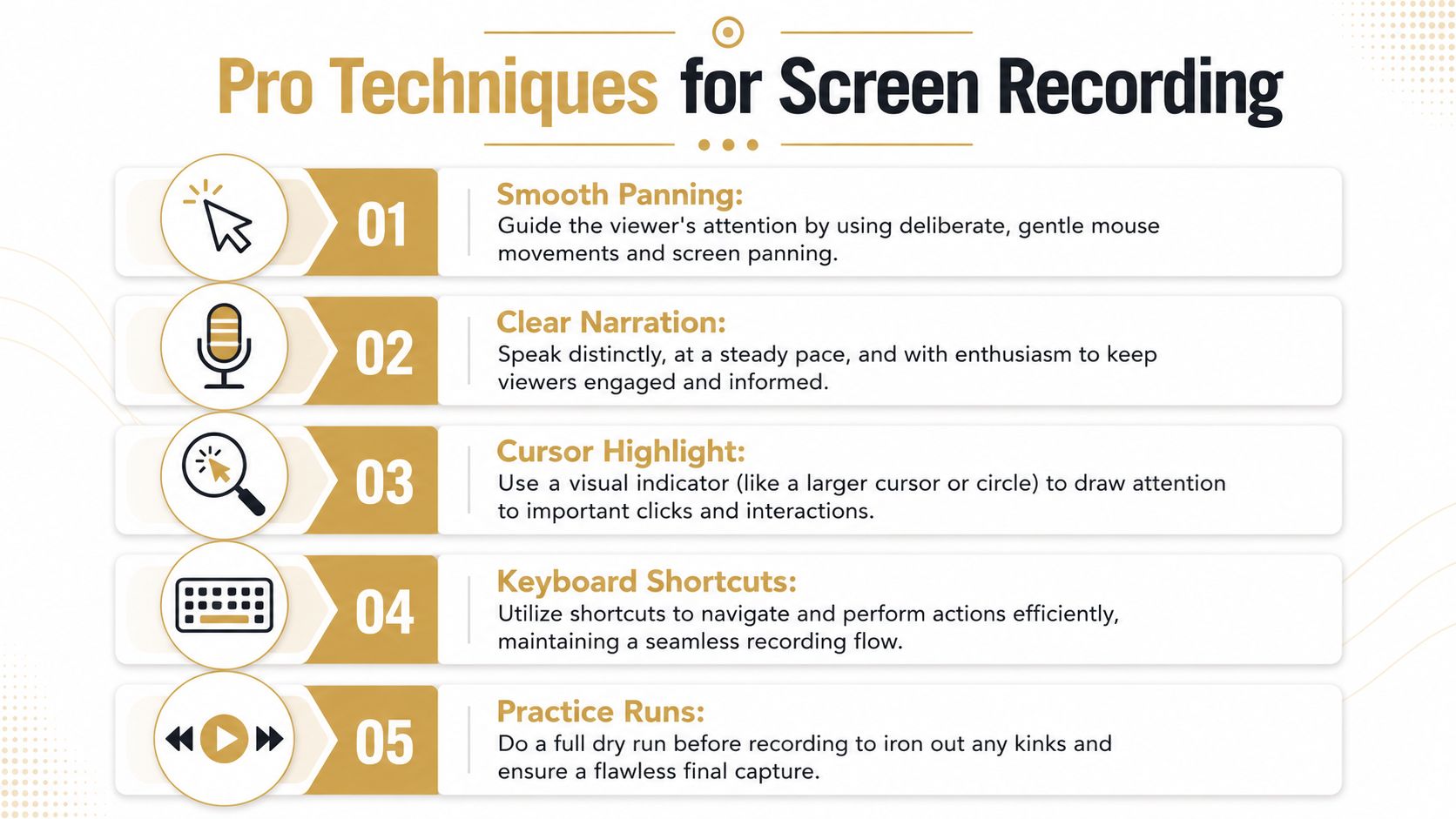
Rehearse until the clicks feel boring
Practice runs matter because the best takes usually feel uneventful. You already know where each menu lives. You know which load screen takes longer than expected. You know where you’re likely to over-explain.
The underlying learning research also supports this style of delivery. A major review of educational video design emphasizes conversational language, manageable cognitive load, segmentation, and a relatively brisk speaking pace of 185 to 254 words per minute. It also found that pushing video length past 6 to 9 minutes is likely wasted effort if you’re trying to maximize attention. That same literature favors learner control, including pauses and review points, over one uninterrupted stream. The details are in the educational video research review.
That doesn’t mean you should talk fast. It means you should remove drag. Hesitation, searching for menus, and filler phrases make a tutorial feel slower than its runtime.
A short rehearsal should confirm three things:
- Sequence: The click path is correct.
- Timing: The narration matches the interface.
- Recovery points: You know where to pause and restart if something goes wrong.
Here’s a quick reference before your real take:
| Recording behavior | What it signals to viewers |
|---|---|
| Smooth cursor movement | Confidence and control |
| Long hunting pauses | Uncertainty |
| Clean transitions between screens | Preparation |
| Frequent self-corrections | Improvisation |
A practical demonstration helps more than theory alone, so this screen recording walkthrough is worth a look before a live capture:
Perform for the edit
Professional screen recordings are rarely one uninterrupted perfect take. They’re a series of clean edit points.
Pause briefly between major actions. Leave a beat after opening a new panel. If you miss a line, stop, breathe, and repeat the sentence cleanly instead of talking through the mistake. Those small gaps make trimming far easier later.
TechSmith’s workflow also recommends practice runs, attention-directing annotations, and clip-speed adjustments to sync narration with on-screen action because post-production is the easiest place to remove dead air and correct timing. That principle holds up in nearly every tutorial workflow, even if your editing stack changes.
Useful habits during capture:
- Narrate the reason, not every click: The screen already shows the click.
- Move the cursor with intent: Don’t swirl, fidget, or circle without purpose.
- Use keyboard shortcuts when they help flow: But only if the viewer doesn’t need to learn the mouse path.
- Hold on important confirmations: Success states deserve an extra beat.
For macOS teams building repeatable screen tutorials, this guide on how to record Mac screen is helpful because it focuses on capture choices, not just button locations.
Use extra angles only when they clarify
A webcam overlay can add trust. A hand shot can help with a hardware tutorial. An iPhone feed can make sense if the lesson spans desktop and mobile. But extra angles only work when they answer a viewer question.
Use them selectively:
- Face cam: Best for intros, transitions, or moments where presence matters.
- Hands or product close-ups: Useful when physical interaction explains the step better than narration.
- Mobile device capture: Necessary when the workflow crosses platforms.
If the added shot doesn’t improve understanding, cut it. A tutorial is not a montage. It’s guided instruction.
Editing for Engagement and Polish
Editing is where tutorial quality becomes visible. Not because fancy transitions suddenly make the video better, but because editing lets you remove confusion and control attention.
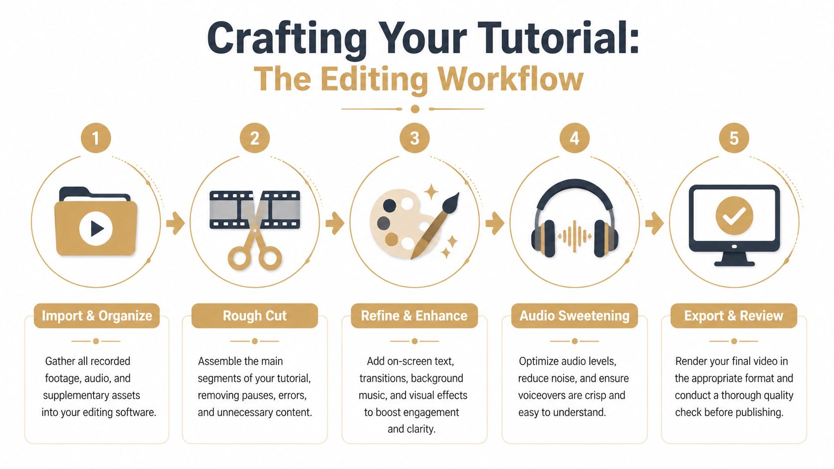
Cut confusion before you add style
Start with subtraction. Trim dead air. Remove wrong turns. Tighten repeated explanations. If a sentence explains what the screen already makes obvious, cut it.
That rough cut should answer one question: can someone follow this lesson without friction?
After that, clean up the pacing:
- Shorten hesitation gaps: Keep momentum steady.
- Preserve orientation pauses: Don’t cut so tightly that the interface feels jumpy.
- Align audio and action: The words should land with the step, not before or after it.
- Standardize starts and stops: Abrupt openings and endings make tutorial libraries feel inconsistent.
A polished tutorial usually has fewer edits than people expect, but they’re placed with discipline.
If the viewer has to rewind because your edit jumped past the important part, the cut was too aggressive.
Direct attention with motion and emphasis
Once the sequence works, add emphasis where the viewer might miss something. In these situations, zooms, cursor effects, click indicators, highlights, and captions earn their keep.
The mistake is using these treatments everywhere. Constant zooming feels restless. Heavy cursor effects can look gimmicky. On-screen text becomes noise when it repeats the narration line for line.
Use emphasis when it resolves ambiguity:
- Automatic or manual zooms: Good for dense interfaces or small controls.
- Cursor highlights and click ripples: Helpful when one click triggers the key action.
- Magnified detail views: Useful for settings, toggles, or compact menus.
- Captions: Important for accessibility, skim viewing, and muted playback.
On-device captioning is especially practical for training libraries because it speeds review cycles and removes the need to send files through extra services. If captions are part of your standard workflow, this guide on adding subtitles to videos walks through the production side cleanly.
Edit multiple angles like an instructor, not a filmmaker
Many tutorials drift into the wrong visual language. General video advice often pushes more movement, more cutaways, and more cinematic variation. Instructional videos need a different standard.
The useful principle is simple: reduce ambiguity.
The best guidance on this point is refreshingly contrarian. To keep multi-angle tutorials clear, use a wide shot for context, a close-up for detail, and only use pickup shots when they create a clean edit point or resolve confusion. Decorative cutaways add style but often weaken comprehension. That’s the core lesson in this breakdown of clear tutorial shooting with multiple angles.
A clean editing decision tree looks like this:
| If the viewer needs… | Use… | Avoid… |
|---|---|---|
| General orientation | Wide or full interface view | Fast punch-ins with no context |
| Precise action detail | Close-up or zoomed crop | Tiny unchanged full-screen view |
| A transition across mistakes | Pickup shot or alternate angle | Hard jump cuts in the same frame |
| Presenter presence | Brief webcam appearance | Face cam covering critical UI |
This is also where tool design can speed up polish. Device frames, perspective treatments, background replacement, cursor smoothing, and a timeline that supports fast trims all help, but only if they serve the lesson. A tutorial shouldn’t feel over-produced. It should feel controlled.
Exporting and Distributing Your Tutorial
A finished edit still isn’t done until it’s packaged for where people will watch it. Many teams make one export, upload it everywhere, and wonder why the result feels awkward on some platforms. Distribution problems usually start at export.
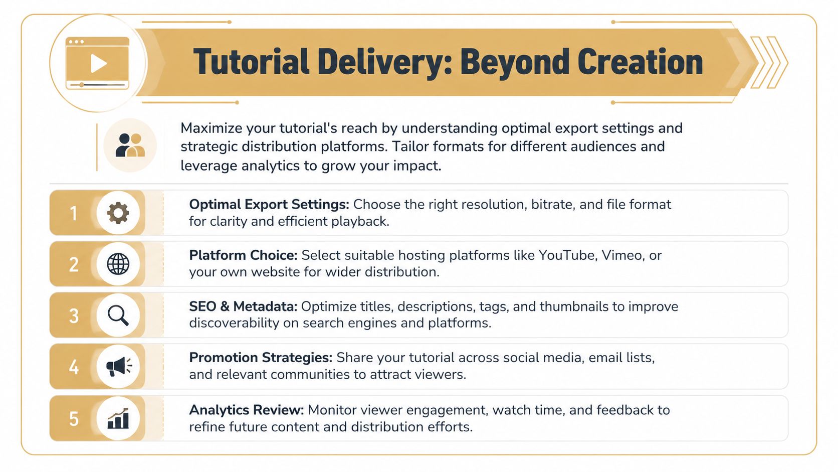
Export for the destination
Choose settings based on use case, not habit. A help-center tutorial, a YouTube explainer, an internal LMS module, and an App Store preview don’t all need the same framing or pacing.
A practical export review looks like this:
- Resolution: Match the destination platform and the legibility needs of your interface.
- Aspect ratio: Keep horizontal for standard tutorials, but don’t force that onto vertical placements.
- File format: Use common formats that play cleanly across devices and browsers.
- Final quality check: Watch the exported file once before publishing. Compression can soften text or distort cursor effects.
Before you send anything live, check for these common misses:
| Final check | What to look for |
|---|---|
| Text clarity | Small UI labels still readable |
| Audio consistency | No sudden volume jumps |
| Caption accuracy | Product names and terms spelled correctly |
| Safe framing | Nothing important cropped on alternate layouts |
Plan one recording for many outputs
This is the modern tutorial problem most generic guides skip. One recording often needs to become several assets. A full walkthrough for YouTube. A shorter support clip. A vertical teaser for social. A cleaner segment for onboarding. If you don’t plan for that at capture and edit time, reuse becomes awkward.
The strongest current approach is reuse-first production. Film with enough context to allow reframing later. Leave space for dynamic zooms. Capture broader interface coverage when you know vertical crops may be needed. That principle is laid out well in this discussion of multi-format tutorial production.
That shift changes how to create tutorial videos in practice. You’re no longer making a single “final video.” You’re creating adaptable source material.
A better distribution workflow looks like this:
- Publish the full version: Use it for onboarding, knowledge base, or launch pages.
- Cut task-specific excerpts: Turn one lesson into smaller answer-oriented clips.
- Create alternate aspect ratios: Reframe for vertical and platform-specific placements.
- Store organized project files: Future updates are easier when the source stays modular.
If your team creates demos, onboarding clips, support walkthroughs, or launch assets on a Mac, Smooth Capture is built for that repeatable workflow. It combines screen recording, timeline editing, cursor effects, automatic zooms, device frames, subtitles, and flexible horizontal or vertical outputs in one macOS app, which makes it easier to go from raw capture to publishable tutorial without stitching together multiple tools.
Ready to create stunning app demos?
SmoothCapture makes it easy to record your screen with 3D device frames, cinematic cursor effects, and professional editing tools.