Mastering the Product Demonstration Video in 2026
You shipped the feature. The positioning is solid. The landing page is live. Then the main problem arises. You need a product demonstration video that makes the product feel obvious in under a few minutes, without looking like a rushed screencast stitched together the night before launch.
That’s where time is often lost. Not because the product is hard to explain, but because the workflow is sloppy. The script is vague, the recording is static, the cursor flies around the screen, the edit drags, and the final export doesn’t match where the video needs to live. A polished software demo needs more than a screen recording. It needs structure, pacing, visual hierarchy, and accessibility baked in from the start.
Modern demo production is also different from the advice you’ll find in older video guides. For software, the gap is usually not “how do I record my screen.” It’s “how do I make this feel like a polished launch asset instead of a support clip.” That’s where simulated multi-angle shots, device frames, smart zoom, on-device subtitles, and clean motion design matter.
Table of Contents
- Why a Great Product Demo Is Non-Negotiable
- Planning Your Demo's Core Message
- Scripting and Creating a Detailed Shot List
- Recording Your Screen and Voice Like a Pro
- Editing for Maximum Clarity and Impact
- Exporting Distributing and Measuring Success
- Common Product Demo Video Questions Answered
Why a Great Product Demo Is Non-Negotiable
A product demonstration video isn’t just a nice launch asset. It often becomes the clearest explanation of your product that buyers, prospects, new users, and even internal teams will ever see.
That matters because people buy when they understand what they’re looking at. According to Medianug’s analysis of product demo video performance, consumers who view a product demonstration video are 1.81 times more likely to purchase than those who don’t, and 69% of consumers identify demonstration clips as the most valuable content format when evaluating purchases.
For software products, this gap is even more visible. A landing page headline can create interest. A feature grid can organize information. But neither can show the feeling of using the product, the speed of the workflow, or the small interaction details that make a tool click.
Demos reduce friction across the whole funnel
The strongest demos don’t live in one place. Teams use them on launch pages, inside onboarding emails, in sales follow-ups, and in help content. One well-made video can answer the same question repeatedly without making a salesperson or support rep repeat themselves.
That’s why a weak demo creates hidden costs:
- Sales pays for it: Reps spend time re-explaining basic workflows.
- Support pays for it: New users ask avoidable setup and usage questions.
- Marketing pays for it: Feature launches look less differentiated than they are.
- Product pays for it: Strong interaction design gets flattened into static screenshots.
Practical rule: If a viewer still can’t explain what changed, what problem got solved, and what to do next after watching, the demo didn’t do its job.
Trust comes from showing real use
A polished product demonstration video builds trust because it shows the product operating in context. Viewers can see sequence, speed, and cause-and-effect. That’s far more persuasive than isolated claims.
This is especially true for software with nuanced workflows. People don’t just need proof that a feature exists. They need proof that it fits into how they work. A clean walkthrough does that fast.
A good demo also helps you control the narrative. Instead of letting buyers infer value from UI fragments, you decide what they notice first, what they understand second, and what they remember at the end.
The standard is higher now
Recording a screen is a common capability. Fewer teams can produce a demo that feels deliberate. Buyers notice the difference immediately. Static views, messy mouse movement, cramped crops, and weak audio all make the product feel less mature than it is.
The quality bar has moved. If your product is polished, your demo needs to match it.
Planning Your Demo's Core Message
Most product demonstration videos go wrong before recording starts. The team opens the product, lists features in order, and hopes the value appears on its own. It won’t.
A strong demo starts with one decision. What should the viewer understand by the end that they don’t understand right now? If that answer is fuzzy, the recording will be fuzzy too.
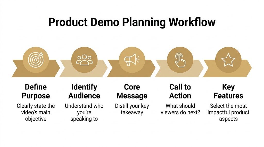
Start with the job of the video
Every demo needs a single job. Not three.
A launch video has a different job from an onboarding tutorial. A sales enablement clip has a different job from an App Store preview. If you mix those intents, the video gets bloated and nobody knows what to cut.
I usually pressure-test the brief with five prompts:
Who is this for Name the viewer precisely. A first-time prospect, a new trial user, an admin evaluating setup, or a customer success lead needs different proof.
What problem are they feeling Use the friction they already recognize. Don’t start with your feature taxonomy.
What’s the one takeaway If the viewer remembers one sentence, write that sentence now.
What action should follow Book a demo, start a trial, activate a feature, or continue onboarding. Pick one.
What should stay out This matters as much as what stays in. Excluding secondary features protects pacing.
Build around a process, not a promise
Feature montages look polished and often perform poorly because they skip the logic of use. Viewers see outcomes without understanding how someone gets there.
That’s why step-by-step structure works so well. According to AMS research on step-by-step product demos, step-by-step product demonstration videos outperform outcome-focused demos in driving sales because the process creates stronger viewer immersion and cognitive flow.
For software demos, that usually means this sequence works better than a feature tour:
- Problem: Show the friction quickly.
- Setup: Show where the user starts.
- Action: Walk through the key actions in order.
- Payoff: Show the result clearly.
- Next step: Tell the viewer what to do now.
When viewers can predict the next step, they stay oriented. That orientation is what makes a software demo feel easy to follow.
Find the real aha moment
The aha moment is not “our dashboard has many capabilities.” It’s the specific instant where the value becomes self-evident. In one product, that might be automatic subtitle generation. In another, it might be swapping a horizontal screen recording into a vertical social cut without re-recording.
That moment should appear early enough to earn attention, but not so early that it lacks setup. You want just enough context for the reveal to land.
A planning brief can stay short. One page is enough if it includes:
- Audience
- Use case
- Core message
- Aha moment
- Primary CTA
- Must-show screens
- Nice-to-have screens
- What to cut
If the team can’t agree on those items, recording should wait.
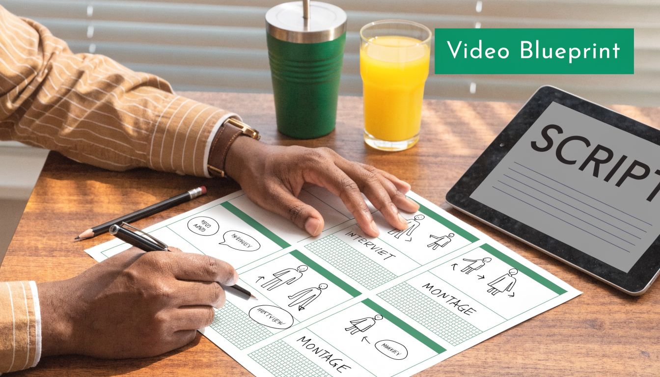
Scripting and Creating a Detailed Shot List
Once the message is clear, the next job is turning that strategy into something a recorder and editor can follow. At this juncture, many teams either over-script and sound robotic, or under-script and ramble through the interface.
The fastest path is a two-column document. Visuals on the left. Spoken line or on-screen copy on the right. It forces discipline because every sentence has to earn a matching visual.
Write to the screen, not to a blog post
Narration for a product demonstration video needs to be shorter than generally expected. If the viewer can already see the action, don’t describe it twice. Add context instead.
Weak line: “We click the settings menu and then choose the subtitle option.”
Stronger line: “Turn on subtitles before export, so every cut is ready for mute autoplay.”
The second line tells the viewer why the step matters. That’s the difference between narration that fills space and narration that drives comprehension.
A few scripting rules keep demos tight:
- Use short spoken sentences: If a line is hard to say in one breath, trim it.
- Prefer verbs over labels: “Trim the intro” lands better than “use the trimming functionality.”
- Avoid feature stacking: One sentence should usually support one idea.
- Read it out loud early: If it sounds stiff in your mouth, it’ll sound stiff in the video.
Your shot list should map to decisions
For software, a shot list isn’t just “Scene 1, Scene 2, Scene 3.” It should capture what the viewer needs to notice at each moment.
That means listing items like:
- Screen state: Logged out, empty project, completed project, import screen
- Capture mode: Full screen, window, or cropped region
- Framing choice: Straight-on, device frame, angled perspective, zoomed detail
- Cursor behavior: Slow intentional movement, click ripple, hidden cursor, guided drag
- Supporting elements: Callout text, subtitle cue, annotation, webcam overlay
This also prevents re-records. If you know a scene needs a clean empty-state screen, you won’t accidentally record with test clutter, stray notifications, or outdated sample data.
Plan simulated angles before the edit
One of the easiest ways to make a software demo look flat is treating every screen as a full-screen front-facing capture. That’s fine for internal training. It’s weak for launch assets.
Plan visual variation in the shot list itself. Mark where you want a device frame, where a 3D perspective treatment makes the product feel more dimensional, and where a close crop should isolate a single interaction. For teams working on Apple-platform assets, this guide on adding a device frame to a screen recording is useful because it shows the framing logic clearly.
Field note: A shot list saves more time in editing than any shortcut key ever will.
A practical shot list doesn’t need to be fancy. A spreadsheet works. So does a simple table in Notion or Google Docs. What matters is that every row ties together the goal, the visual, and the spoken line. If those three things drift apart, the final video will feel stitched together even if the transitions are smooth.
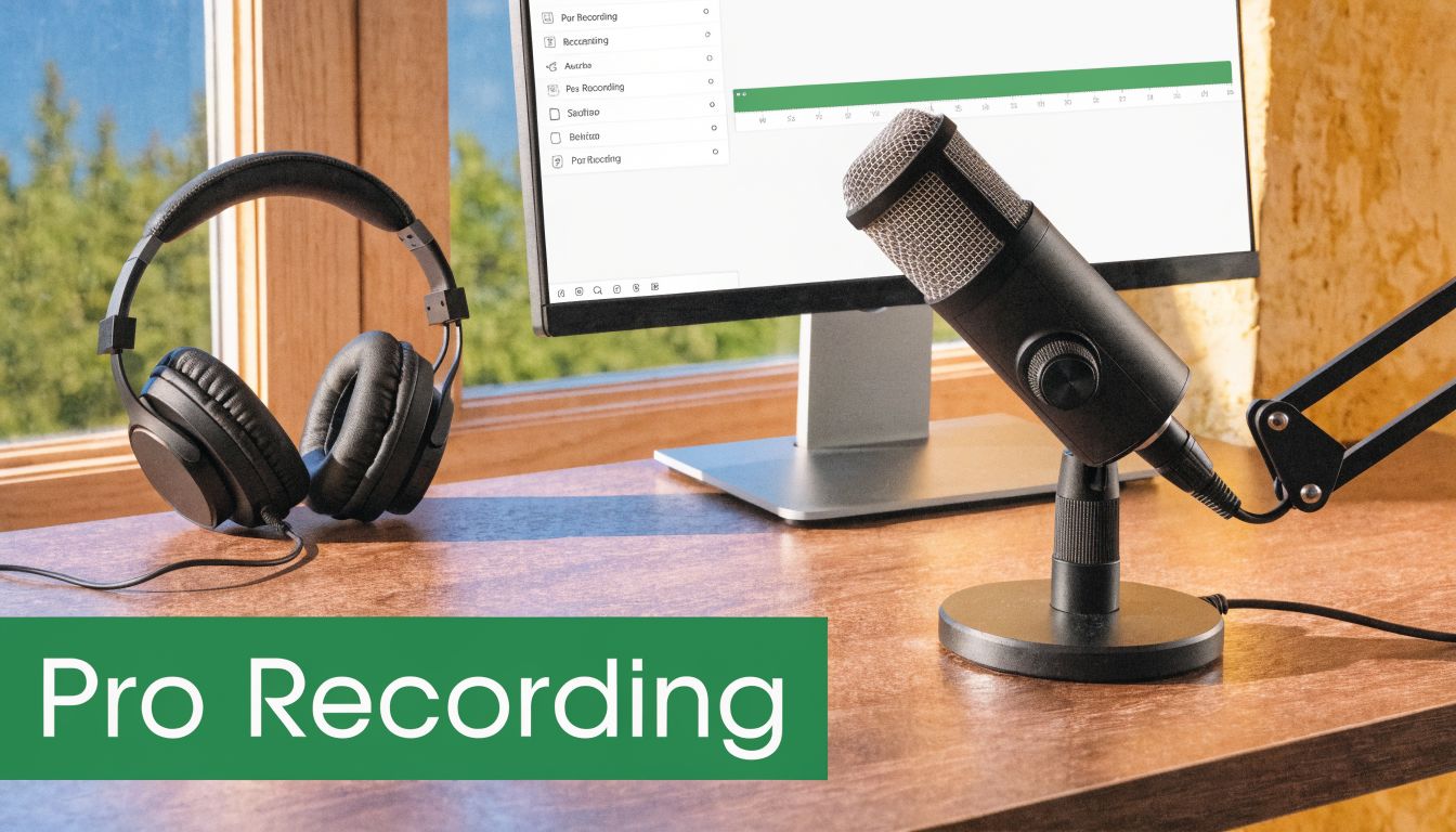
Recording Your Screen and Voice Like a Pro
Recording is where planning either pays off or gets exposed. If the setup is inconsistent, you’ll feel it immediately in the edit. Mouse movement looks frantic, windows don’t align between takes, audio tone changes, and the product itself starts to feel less polished than it really is.
For software demos, clean capture matters more than fancy gear. You need stable visuals, intentional motion, and audio that doesn’t force the viewer to work.
Set up the recording before you touch the mic
Record in the aspect ratio you need, or at least in a format that gives you room to crop intelligently later. Teams often capture a generic full desktop and hope to rescue it in post. That usually creates small UI, awkward reframing, and inconsistent composition.
Before recording, check these basics:
- Clean the desktop: Remove stray files, notifications, and irrelevant apps.
- Standardize the product state: Use controlled demo data and predictable starting screens.
- Increase readability: Zoom system UI if text will otherwise look cramped after export.
- Lock the environment: Close chat apps, pause sync popups, and disable visual distractions.
- Use a repeatable capture workflow: If you’re on macOS, this walkthrough on how to record your screen on Mac covers the practical setup choices that affect downstream editing.
If you’re showing mobile software, direct device capture usually looks cleaner than filming a phone display. For Apple-platform products, plugging in an iPhone or iPad and recording the screen directly gives you sharper source material and more flexibility for framing later.
Use motion and framing to avoid a flat screencast
Static single-angle screencasts are one reason so many demos feel lifeless. According to Spiel Creative’s analysis of multi-angle product demos, 70% of software demos fail to engage due to static, single-angle views, and the same analysis points to conversion gains from using device frames and simulated angle changes more deliberately.
For software, “multi-angle” doesn’t mean setting up physical cameras. It means changing how the screen is presented over time so the viewer’s attention stays directed.
That usually includes a mix of:
- Straight captures for clarity: Best when the viewer needs to read UI and follow sequence.
- Device frames for context: Useful when positioning the software as a real product experience, especially for app previews.
- Perspective shifts: Light 3D angles can add dimensionality during transitions or hero moments.
- Punch-in crops: Zoom into the exact control that matters instead of asking the eye to search.
- Cursor treatment: Smooth interpolation and click effects make interactions legible.
One option here is Smooth Capture, a native macOS tool that records screens and edits demos with device frames, 3D perspective treatments, cursor effects, automatic zoom, and on-device subtitles in one workflow. That kind of all-in-one setup is useful when the same team has to produce launch assets, onboarding videos, and social cut-downs without moving through several apps.
Here’s a good visual reference for what polished software walkthrough pacing can look like in practice:
Record voice separately when clarity matters
Live narration while clicking through the product sounds efficient. It usually creates compromises. Your cursor timing gets worse because you’re trying to perform and explain at once. Your voice also changes as you react to the interface.
For launch-quality demos, separate voice recording is usually cleaner. Record the screen first. Then read the script against a rough edit.
That gives you three advantages:
Tighter pacing You can trim dead movement before recording the voice.
Better delivery The narration becomes more intentional because you’re reacting to locked visuals.
Cleaner edits Replacing one visual beat won’t force a complete voice re-record.
If you do record live, keep your setup simple. A decent USB microphone, closed-back headphones, soft furnishings in the room, and consistent mouth-to-mic distance will carry you further than overcomplicated audio chains.
A few things consistently hurt quality:
- Fast cursor movement
- Tiny interface elements
- Reading the UI word-for-word
- Clicking without pause
- Background hum from fans or untreated rooms
The goal isn’t cinematic audio. It’s trust. If people can hear you clearly and follow the interface without strain, the product feels easier to adopt.
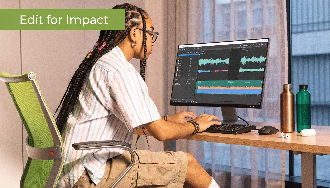
Editing for Maximum Clarity and Impact
Editing is where the demo becomes persuasive. Raw footage only proves that the product exists. The edit determines whether the viewer understands it quickly enough to care.
Most software demos need less decoration and more hierarchy. Viewers should never wonder where to look, why a step matters, or whether the video is about to end.
Cut for comprehension, not for decoration
The first pass should be ruthless. Remove loading pauses, cursor wandering, retries, menu hunting, and any transition that exists because it looks stylish instead of helping the viewer orient.
A good software demo edit usually does these things in order:
- Trim dead air early
- Arrange clips to preserve cause-and-effect
- Shorten repetitive flows
- Use zoom only when focus needs tightening
- Add annotations only where the UI alone won’t teach enough
The biggest pacing mistake is leaving too much “real time” intact. Real product use is often slower than watchable product storytelling. Editing closes that gap.
Keep the sequence truthful, but don’t preserve every second of friction just because it happened on screen.
Use AI features where they remove friction
AI in demo editing is useful when it cuts repetitive work, not when it adds novelty. The practical wins are automatic subtitles, smart zoom, focus detection, and background cleanup. Those reduce manual keyframing and make it easier to ship polished assets on a normal production schedule.
That matters more now because fast comprehension is harder to earn. According to What a Story’s guide to product demo trends, AI-enhanced demos with features like smart zoom and automatic subtitles can increase viewer retention by 40%.
The important part is how you use those features:
- Smart zoom should follow intent: Zoom only when the viewer needs help locating a control.
- Automatic subtitles need review: Fix product names, feature terms, and punctuation.
- Focus detection should support pacing: Don’t let it create constant motion.
- Background replacement should stay quiet: Gradients and subtle visuals work better than loud textures.
If the viewer notices the editing more than the product, the edit is overworked.
Accessibility should shape the edit
Accessibility isn’t a final export checkbox. It changes how you build the timeline.
Subtitles help people watching on mute, viewers in noisy environments, and anyone processing information better with text reinforcement. Clear cursor effects help users track small interactions. Intentional pauses between steps give more people time to follow the sequence.
A few practical standards improve most demos immediately:
| Editing choice | Why it helps |
|---|---|
| Karaoke-style subtitle highlighting | Reinforces timing between speech and action |
| Visible click ripples | Makes interaction points obvious |
| Controlled zoom speed | Reduces disorientation |
| Higher contrast callouts | Helps labels stand out against busy UI |
| Shorter scenes | Keeps the mental model fresh |
The final polish usually comes from restraint. One clean zoom is better than five. One annotation at the exact right moment beats a constant overlay layer. The best edits feel obvious in hindsight because every choice supports the product instead of competing with it.
Exporting Distributing and Measuring Success
A polished timeline can still fail in the last mile. Wrong export settings soften the UI. Poor placement kills completion. Weak measurement leaves the team arguing about whether the video worked.
This part needs the same discipline as scripting and editing. Export for where the video will appear. Distribute it where it can do a specific job. Measure what happens after people press play.
Export for the placement, not for your timeline
Different placements tolerate different levels of detail. A YouTube walkthrough can support more on-screen density than a social cut-down. An App Store preview needs cleaner framing and faster read times than a feature announcement embedded in a help article.
Use this as a practical starting point:
| Platform | Resolution | Frame Rate (fps) | Bitrate (Mbps) | Format |
|---|---|---|---|---|
| YouTube | 1920×1080 | 30 | 8 to 12 | MP4 |
| LinkedIn and X | 1920×1080 | 30 | 6 to 10 | MP4 |
| Instagram Reels and Shorts | 1080×1920 | 30 | 8 to 12 | MP4 |
| App Store preview | Match the required device orientation and storefront placement | 30 | Moderate, with readability checked after upload | MP4 or MOV |
| Help center embed | 1920×1080 or 1280×720 | 30 | Balanced for fast loading and clear UI | MP4 |
If you’re preparing store assets, this guide to App Store preview video production is a useful reference because the constraints are less forgiving than standard web video.
Distribution works better when the video has a job
One master demo can support multiple channels, but don’t upload the exact same file everywhere without context. Placement changes viewer intent.
A few examples:
- Landing page: Keep the opening sharp. People are deciding whether to stay.
- Sales outreach: Use a short clip that answers a specific objection.
- Onboarding email: Focus on one workflow, not brand storytelling.
- Help center: Prioritize clarity, labels, and searchable chapters if supported.
- Social cut-downs: Lead with the most visually legible moment.
Measure the behavior after the play click
For SaaS demos, Product Marketing Alliance notes that recorded product demo videos see average completion rates of 35-50%, and that demos longer than 3 minutes often see a meaningful spike in abandonment.
That doesn’t mean every good demo must aim for the same duration. It means length has to earn itself. If a scene doesn’t improve understanding or move the viewer toward the next step, cut it.
The metrics that matter most are usually:
Completion rate Useful for spotting pacing problems and overlong sections.
Drop-off points These reveal where viewers stop finding the video useful.
Click-through to the next step This shows whether the CTA and placement are aligned.
Activation behavior after viewing For onboarding and product education, this matters more than raw views.
Measurement check: Don’t treat views as success if viewers leave before the core workflow appears.
Teams get the best feedback loop when they compare video performance against specific jobs. A launch demo should improve comprehension and action on the launch page. An onboarding demo should reduce confusion and increase feature adoption. If you measure everything the same way, you’ll optimize for the wrong outcome.
Common Product Demo Video Questions Answered
How long should a product demonstration video be
Shorter is usually better, especially for first-touch marketing assets. If the video is recorded for SaaS, the performance guidance above is a good constraint to respect. If you need more depth, split the content into a short primary demo and separate supporting tutorials.
Should the demo use voiceover, subtitles, or both
Both is usually the safest choice. Voice adds pace and personality. Subtitles improve accessibility and make the video usable in silent autoplay environments. For some social or product-led formats, visual-only demos can work well if the interface is simple and the motion design is doing enough explanatory work.
Is one product demo enough
Usually not. At least a small system is often needed, not a single asset. One overview demo, a few feature-specific clips, and shorter distribution variants go much further than trying to cram every audience and use case into one video.
When should you outsource production
Outsource when internal teams can’t get the needed polish, not just because video feels intimidating. If the product changes constantly and you’ll be updating demos often, an in-house workflow usually makes more sense. If you need a major brand film or live-action production, external support may be the better fit.
What’s the biggest mistake teams make
They record before deciding what the viewer needs to understand. The second biggest mistake is treating software like it should be shown from one fixed angle the entire time.
Do you need expensive tools to make a strong demo
No. You need repeatability more than complexity. A tool that records cleanly, supports controlled framing, handles captions well, and lets you edit without friction will outperform a bloated stack that slows the team down.
If your team produces demos often, Smooth Capture is built for that repeatable workflow on macOS. It records screen, window, and device footage, adds device frames and 3D perspectives, supports cursor effects and smart zoom, and handles editing and on-device subtitles in one place. That setup is useful when you need polished launch videos, onboarding tutorials, and social cut-downs without rebuilding the process every time.
Ready to create stunning app demos?
SmoothCapture makes it easy to record your screen with 3D device frames, cinematic cursor effects, and professional editing tools.